Design for Positive Change

Mithun

Brand Identity

Mithun is a celebrated design firm with offices in Seattle and San Francisco. They deliver inspired planning, architecture, interior and landscape design solutions to clients across North America. An early and distinguished leader in the move to sustainability, the firm is recognized for its ability to transform space into rewarding human experiences. Turnstyle partnered with Stoke to establish strategic positioning and a comprehensive new visual identity system. 

Client

Mithun

Disciplines

Image (above)

Image Mir / Design Mithun

Mithun logo with location and website details.

Strategy

With the rise of urbanization, technology, sustainability and cultural convergence driving the success of their practice, Mithun sought to clearly define and express its brand to new, broader audiences.

Working with strategy partners Stoke, we conducted stakeholder interviews, research and competitive audits to explore Mithun’s authentic identity and competitive distinctions. A brand position was developed that celebrates Mithun’s design-first, mission-driven initiative: a design firm with greater purpose to create positive change.

We established brand architecture, nomenclature and a comprehensive messaging system expressing Mithun’s ability to capture opportunities and conquer the challenges posed by the future—for clients, society and the environment.
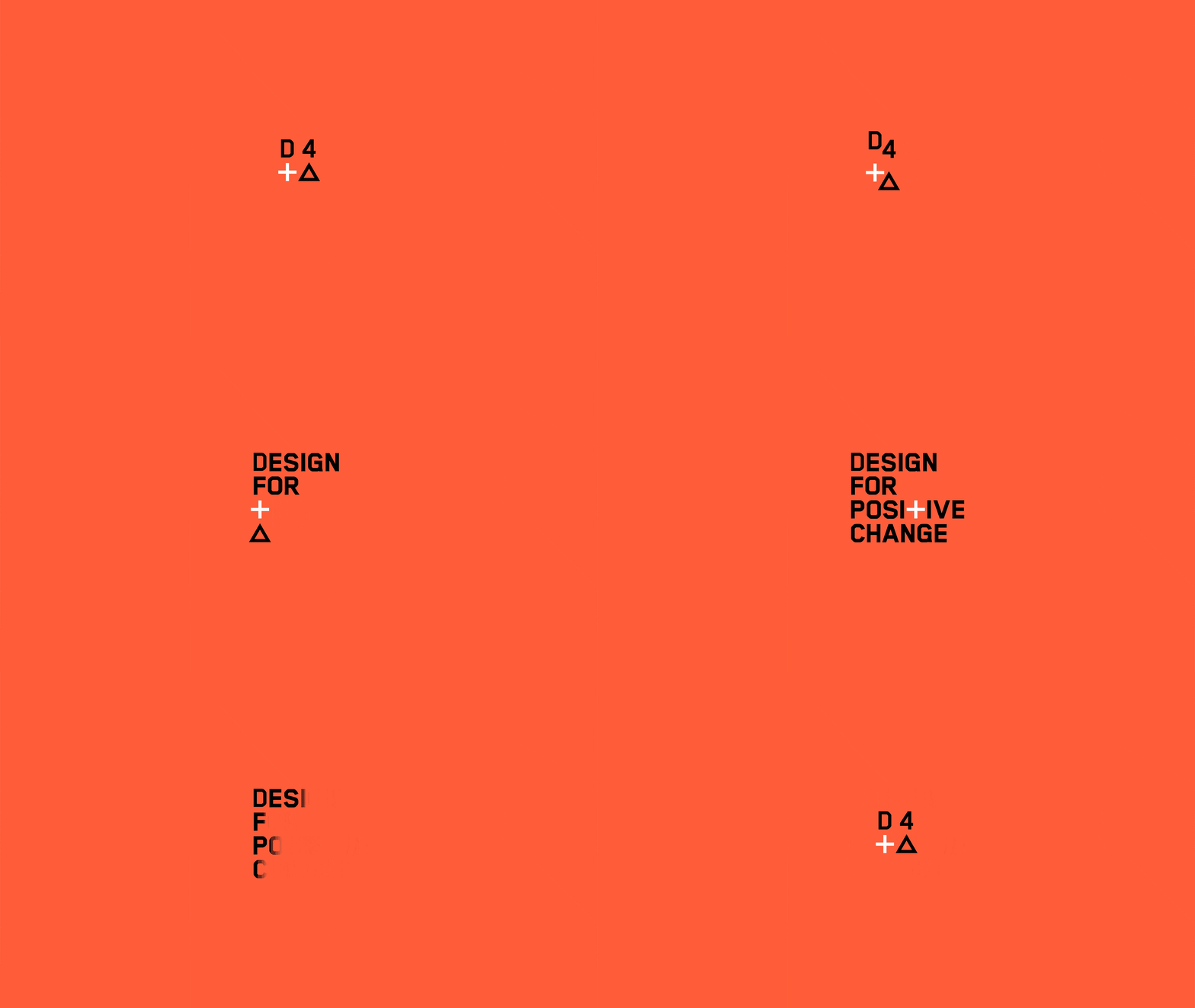
Animation of Mithun’s design-first, mission-driven initiative on an orange background with the characters "D", "4", "+", "▵" transforming into the words  "Design For Positive Change".

Design System

Turnstyle developed an extensive new visual identity system, including an updated color palette, typography and a structured grid system. Modernist organizational sensibilities coupled with bold typography and a restrained, but occasionally bright, color palette infuse materials with a sense of positive vitality.

Mithun branded stationery suite including business cards, letterhead, a brochure, and envelopes, in a clean white and orange palette with bold typography and the tagline "Design for Positive Change."
A close-up of Mithun business cards and letterhead, showcasing the clean typographic wordmark in black and orange on crisp white stock.
A flat-lay of Mithun business cards showing front and back designs, with the orange wordmark, geometric plus and triangle symbols, and office location details for Seattle and San Francisco.
Mithun letterhead and business card alongside an orange panel displaying the "Design for Positive Change" tagline, showing Seattle and San Francisco office details in the brand's orange and black typography.

Collateral

A variety of collateral materials—including stationery, a proposal system, project data sheets, powerpoint templates, presentation poster templates, construction sit banners and promotional materials—were developed. The structured system is beautifully spare, even utilitarian, in it’s aesthetic to set an intentional stage for Mithun's work without stealing the spotlight.

Mithun brochure cover featuring large orange "D4" typography and the "Design for Positive Change" tagline with geometric plus and triangle symbols, set against a photo of a modern mixed-material building exterior.
A Mithun brochure spread with an orange page bearing the firm's purpose statement alongside a full-bleed photo of a glass and wood building facade reflecting the surrounding landscape.
A Mithun brochure spread featuring a project case study titled "New Roots for Timber Giant," with a full-bleed photograph of a rooftop terrace with native plantings against a downtown Seattle skyline.
Two Mithun project cut sheets side by side: "New Gateway to Mission Bay," an affordable housing development in San Francisco, and "Living Building in the Trees," a sustainability-focused treehouse structure in West Virginia.
A Mithun project presentation board titled "Opening Doors, Changing Lives" featuring a Goodwill job training and education center, with exterior and interior photography showing warm wood ceilings, a light-filled stairwell, and community gathering spaces.
A Mithun project presentation board titled "Neighborly Infill" featuring a rendering of the Block 136 mixed-use development in Portland, OR—a brick building with ground-floor retail and apartments set along a busy urban street.
A Mithun project presentation board titled "Urban Green Living" featuring the Mosler Lofts in Seattle, with a dusk rendering of a glass high-rise and an interior photo of a modern residential space with city views.
A kraft paper mailing tube with a branded Mithun label, with architectural drawings visible emerging from one end.
Two Mithun architectural documents for the Wanapum Heritage Museum—a project summary sheet and a detailed floor plan—printed in the clean branded typographic style.
Exterior dusk photograph of a Mithun-designed building with a low-profile timber and glass structure nestled among native shrubland grasses. Photo by Ben Benschneider

Codification

Brand guidelines capture and document the new visual system, giving internal team members the tools they need to easily create on-brand communications. 

A multi-page spread of the Mithun Visual Style Guide, showing sections covering the logo, color palette, typography, photography, and graphic elements in the brand's orange, teal, and neutral system.
Black and white Mithun t-shirts featuring the "D4+△" graphic in the brand's orange and white typography, representing the firm's "Design for Positive Change" identity.
A large orange Mithun banner hung on a chain-link construction site fence, displaying the wordmark and Seattle and San Francisco office locations against a crane-filled skyline.

Next Project

UNLOCKING HUMAN POTENTIAL