Small town Schmall town
City of Spokane
Brand Identity
Capital of the Intermountain NW
Spokane is a vibrant metropolitan center serving as the cultural, economic, educational and social hub of the Intermountain Northwest. Visit Spokane enlisted Turnstyle (and brand strategy partner Stoke) to create a new brand identity for the city to help differentiate them from competitor destinations.

Background
The city of Spokane, WA enjoys a lovely natural setting with a mild four-season climate. It features an urban river gorge winding through downtown, a vibrant shopping and dining scene, lively college campuses, and great urban amenities—without the traffic, density and logistical hassles that often compromise city living.
However, Spokane was perceived as “the same” as it’s competitors—and not particularly recognized as a “destination.” So when the city’s tourism board, Visit Spokane, began an effort to attract more conventions and tourists, it realized the need to clearly differentiate Spokane from other similarly-sized destinations—and give visitors a reason to choose Spokane.
Visiting Spokane understood that tourism is essentially the front door to economic development in the entire region, so it was vital to the mission that the new brand be embraced by the whole city.
Strategy
Over 1,200 interviews were conducted with visitors and residents. Additionally, a Brand Ambassador Council was set up—composed of 16+ major organizations in Spokane including corporations, universities, small businesses, non-profit organizations, civic partners and other key stakeholders to advise and consult during the brand process.
The research revealed some key drivers that differentiate the city, including a diverse food and restaurant scene that showcases local cuisine; a hassle-free airport; year-round festival programming; outdoor escapes; and easy access to urban amenities. People enjoy the city for it’s lively food culture, civic engagement, and relaxing, friendly atmosphere.
Based on this research, a brand position was developed that highlights Spokane’s unique natural geography combined with its creative, enterprising spirit—a vibrant metropolitan center serving as a cultural, economic, educational and social hub of the Intermountain Northwest.

Logos
Pine trees are often associated with the Intermountain Northwest. In addition, they represent nature, growth, might and resilience. The simple, geometric pine tree mark embedded in the logotype represents Spokane’s natural setting. The mark can be used independent of the logotype as shorthand, especially in scenarios with size or format restrictions, such as on social media.
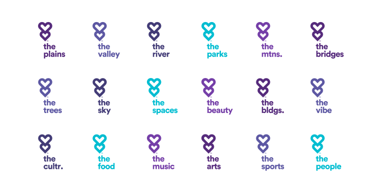
Graphically speaking, nothing represents love more iconically than a heart. By flipping the pine tree mark upside-down, we created a secondary, double-heart icon that can pair with words highlighting the innumerable features and characteristics of the Spokane region that people love.

Patterns
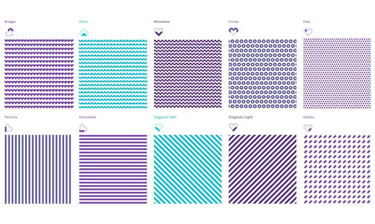
A set of nine patterns—bridges, rivers, mountains, circles, dots, dashes, verticals, horizontals, and diagonals—represent both iconic physical features of the Spokane region as well more abstract ideas such as momentum and optimism. These patterns—derived from the heart icon—provide a unified set of supporting graphics that celebrate the region and add richness to the look and feel of the visual identity system
Color
The primary purple brand color palette is inspired by the iconic Spokane lilacs. Secondary shades of aqua are inspired by the Spokane River and tertiary shades of gray are inspired by the bridges spanning the river gorge.


Implementation and Co-branding
Turnstyle provided thorough brand guidelines to assist Visit Spokane’s team as they develop branded materials across multiple touch points. In addition, the guidelines were shared with other regional organizations, such as Greater Spokane Incorporated or Downtown Spokane Patnership, in an effort to build visual equity across parallel endeavors.


Next Project