Portal to Adventure
Wizards of the Coast
Logo and Visual Identity
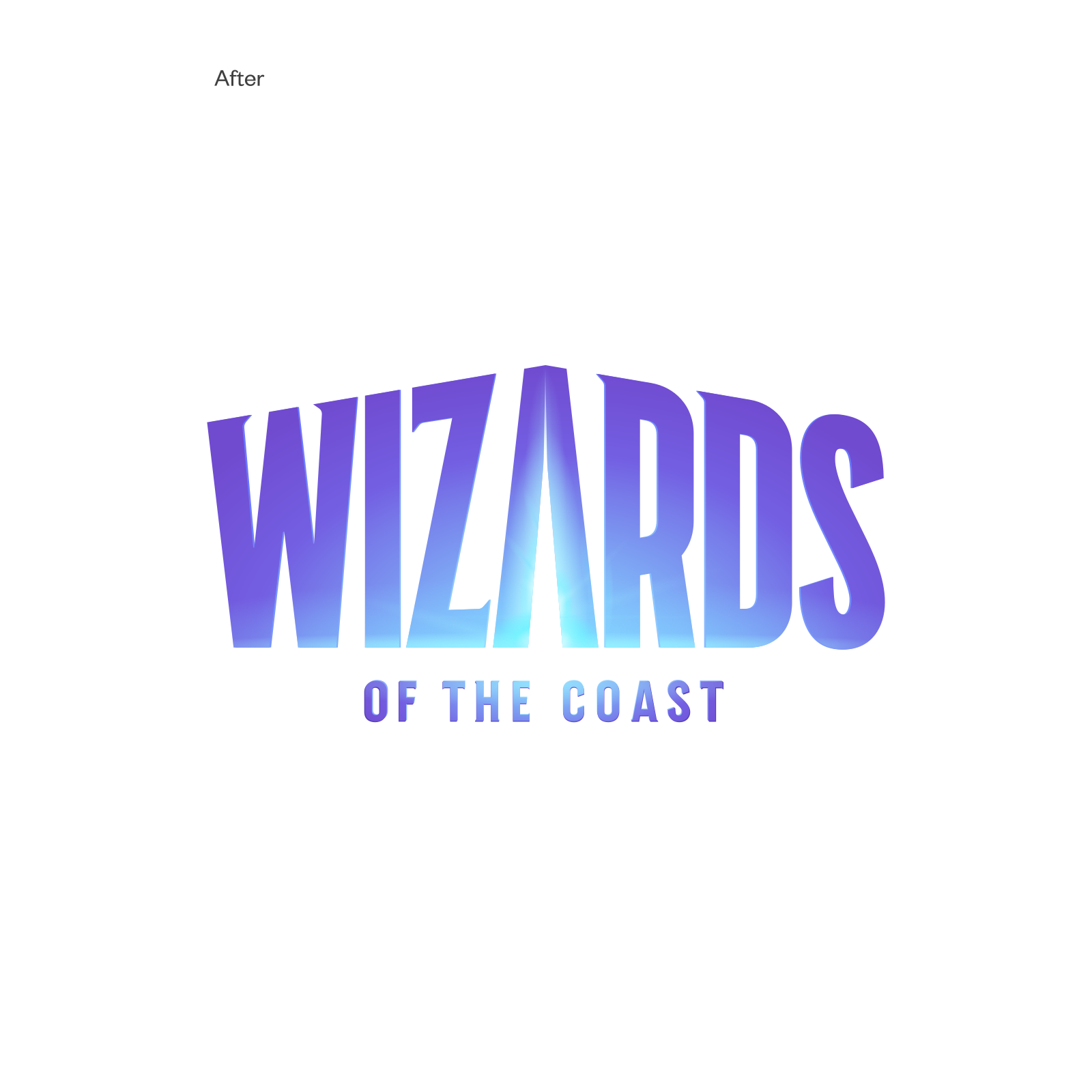
A subsidiary of Hasbro, Wizards of the Coast is a family of studios specializing in building role playing, trading card, and digital games, including legendary titles like Dungeons & Dragons and Magic the Gathering. As they continue to expand their mandate to include entertainment of all media (think movies, streaming video and branded merch), they needed to update their logo and visual style. The new logo creates a literal portal to adventure, inviting their passionate fans to walk through and experience a lifetime of epic adventures.

Standalone Symbol
The standalone W symbol is a visual shorthand for the full Wizards of the Coast logo identity and is a great alternative to the full logo for small digital spaces like social media. It's also used when context for the brand has already been established—for instance, on interior slides of a presentation, or interior event signage.



Next Project